The latest alpha release of the Camunda BPM Platform ships with a revamped design of Tasklist and improved accessibility.
Read all about it in this post.
A cleaner UI
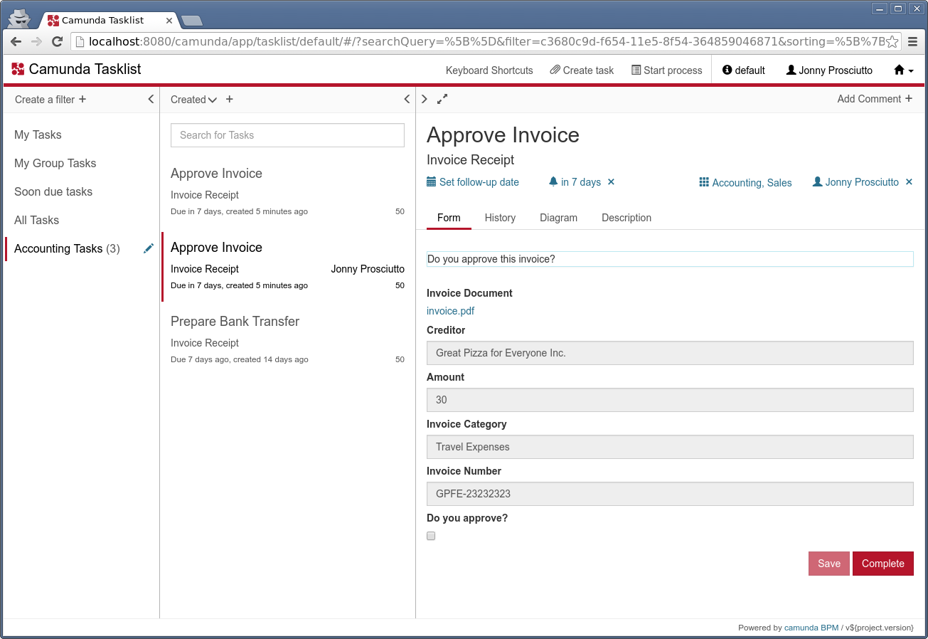
And here it is, the new design of Camunda Tasklist:

We wanted to give it a more “stripped down” look, tune back on colors and backgrounds and put emphasis on function.
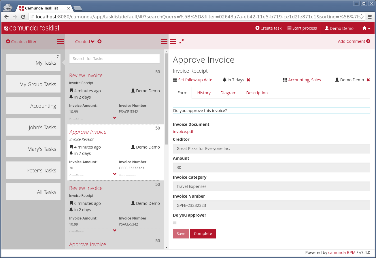
For comparison, this is what Tasklist looked like before:

Custom Styling
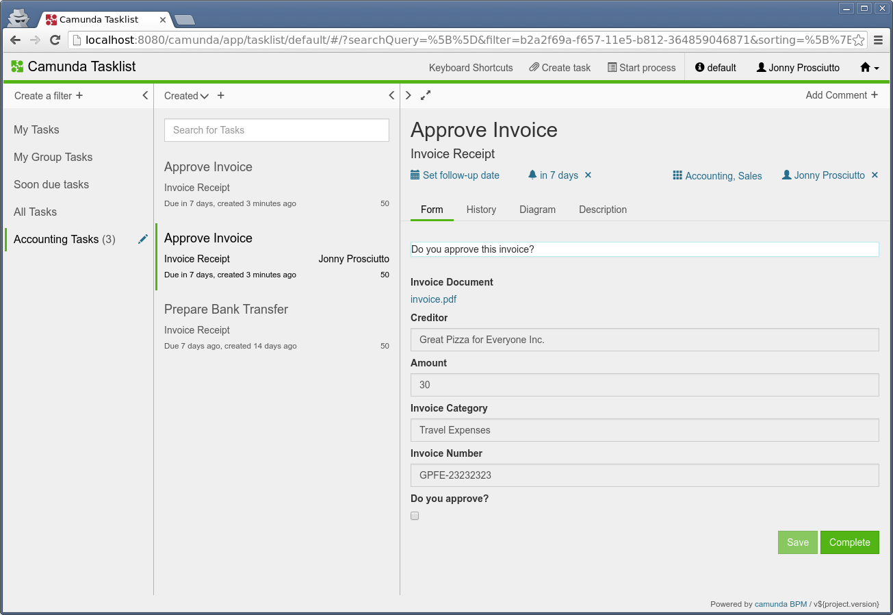
Also, we feel that the new version responds a lot better to custom styling.
For example, this is what it can also look like if you really like gray backgrounds and your company brand color is green:

Improved Accessibility
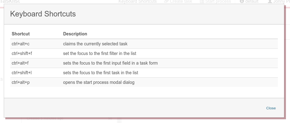
Another major improvement of the Tasklist UI is accessibility. You can now navigate Tasklist with the keyboard.
It is possible to TAB through all the choices and there are some custom shortcuts for productive use.

Feedback
We hope that you like the new design of Tasklist as much as we do. We are always grateful to get feedback on our work. You can comment below this post or open threads in the Forum.
