We are happy to announce the release of Camunda Optimize version 2.2.0-alpha1.
This release marks the first alpha release of Camunda Optimize 2.2.0. Although it is just an alpha release, it is already packed with new brilliant features. The release allows to group process instance frequencies and durations by variable. Also you can perform additional operations like minimum, maximum and median on duration reports. Narrow down your view on the data even further by using the new canceled process instance only or non-executed flow node filter. Use Optimize to see even faster when certain targets (e.g. KPI’s or SLA’s) were not met by using the the new goal line in the bar chart. The new version contains not only improvements in the report builder – now you have advanced possibilities regarding the import of complex process variables. Also the UI/UX of Optimize got some improvements, e.g. finding your desired report or dashboard is now a piece of cake, since you can just filter for the name you are looking for.
The complete release notes are available in Jira.
You can try out a free trial of Camunda Optimize.
Group by Variable
We improved the UI of the control panel in the report builder in general, but also added a new option for the group-by operator. This allows you to group process instances by their variables. Using this new functionality, you can for example investigate if certain variable values have an influence on the process instance duration or if there are unusually many (or few) instances with specific variable values.
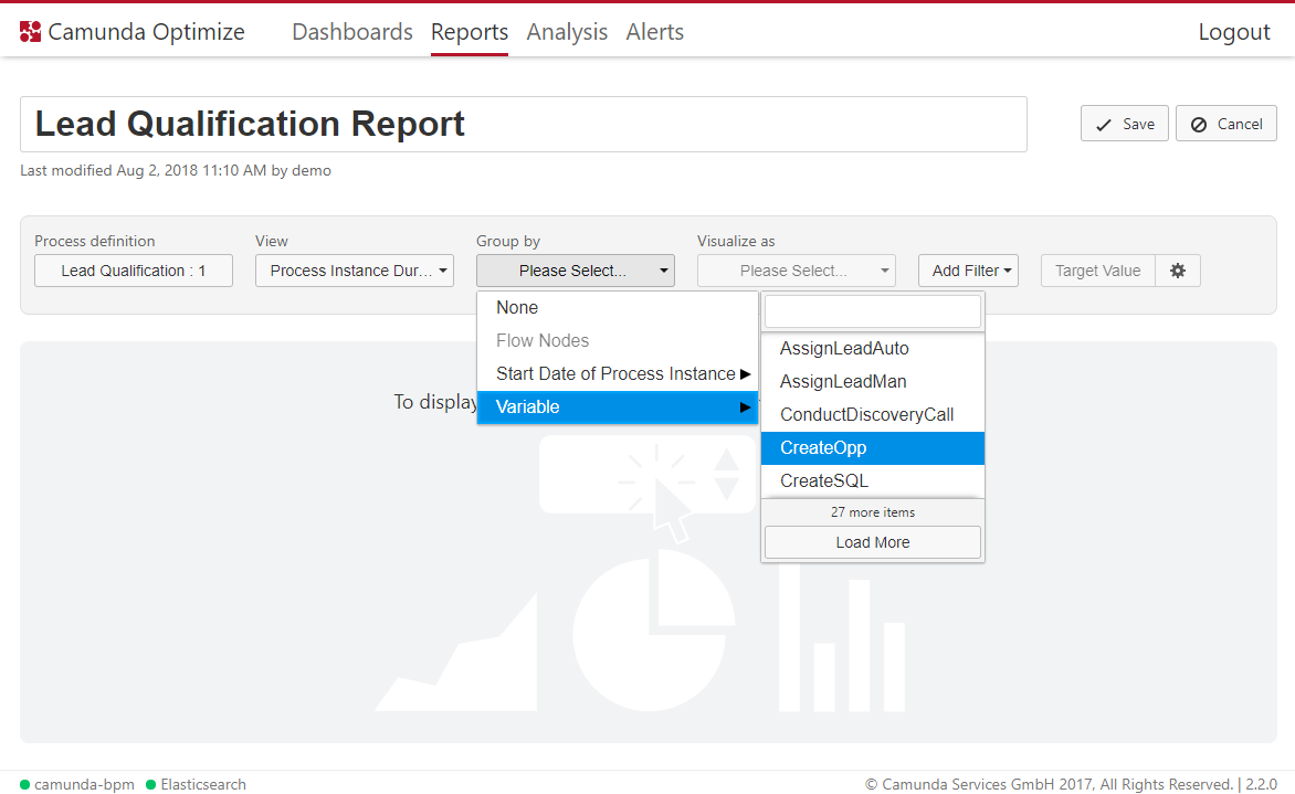
To use this feature, you need to select a process definition, version and view in the Report edit view and then open the group by variable menu. Under the Variables option you see all variables that occurred for this process version. You can use the search box at the top of the list to quickly find the desired variable. Keep in mind that the group by variable option is only available for views dealing with process instances.
New duration operations
With the old version of Optimize it was already possible to get the average duration. However, the problem with that is if you are interested in the outliers, e.g. process instances that took a every long or short time. Why? Maybe the longer a process instance is running the more money it costs. Thus, it would make sense to find out to find exactly those process instances and with the new operations maximum and minimum this is possible. There is also another aspect with outliers: extreme values distort the average value. To compensate that fact it also possible retrieve the median of the duration. As an example see the following dashboard, which compares the different operations that you can perform on the process instance duration:
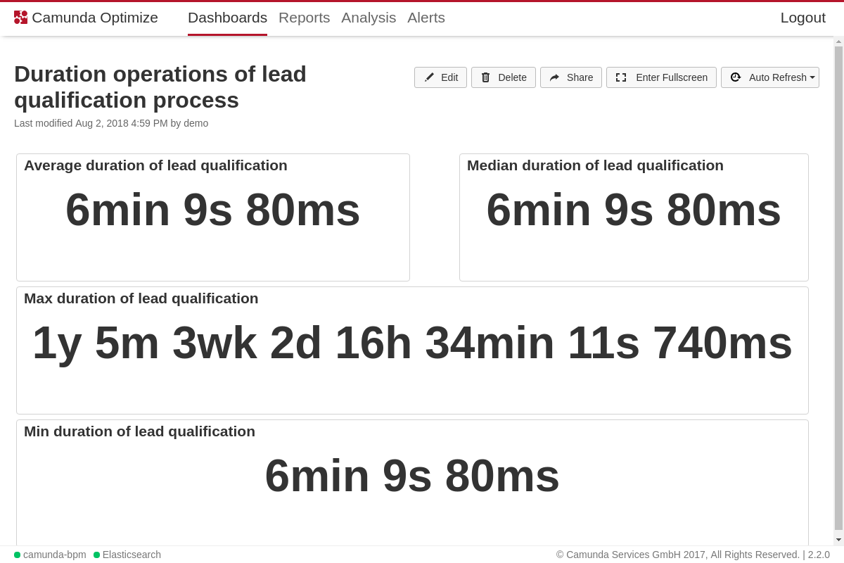
But that not the end of the story. The new operations can not only be applied on the process instance duration, but also on the flow node duration. This gives you even more flexibility to find outliers and make your reports more robust against outliers on a flow node level.
Bar chart goal line
It is possible now to set a goal line on bar charts in Optimize. This is useful to highlight the bars above or below a certain value. For example, supposing that the number of completed process instances every month should always be above 10. This can be done by setting the target value in the bar chart view to 10. Now if the number of process instances is below 10 in any month, that month will be highlighted in red as shown.
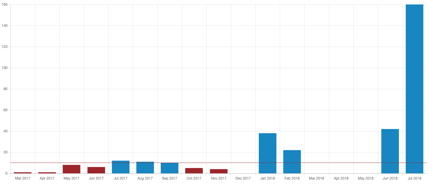
This feature can be also used with every other bar chart visualization.
New filters
In order to give you the possibility to create even more specific and precise reports, with the newest Camunda Optimize version we introduce new filters: cancelled instances only filter and the extension for the executed flow nodes filter, which was present in previous releases as well, but now you can also filter by flow nodes which were not executed during the process.
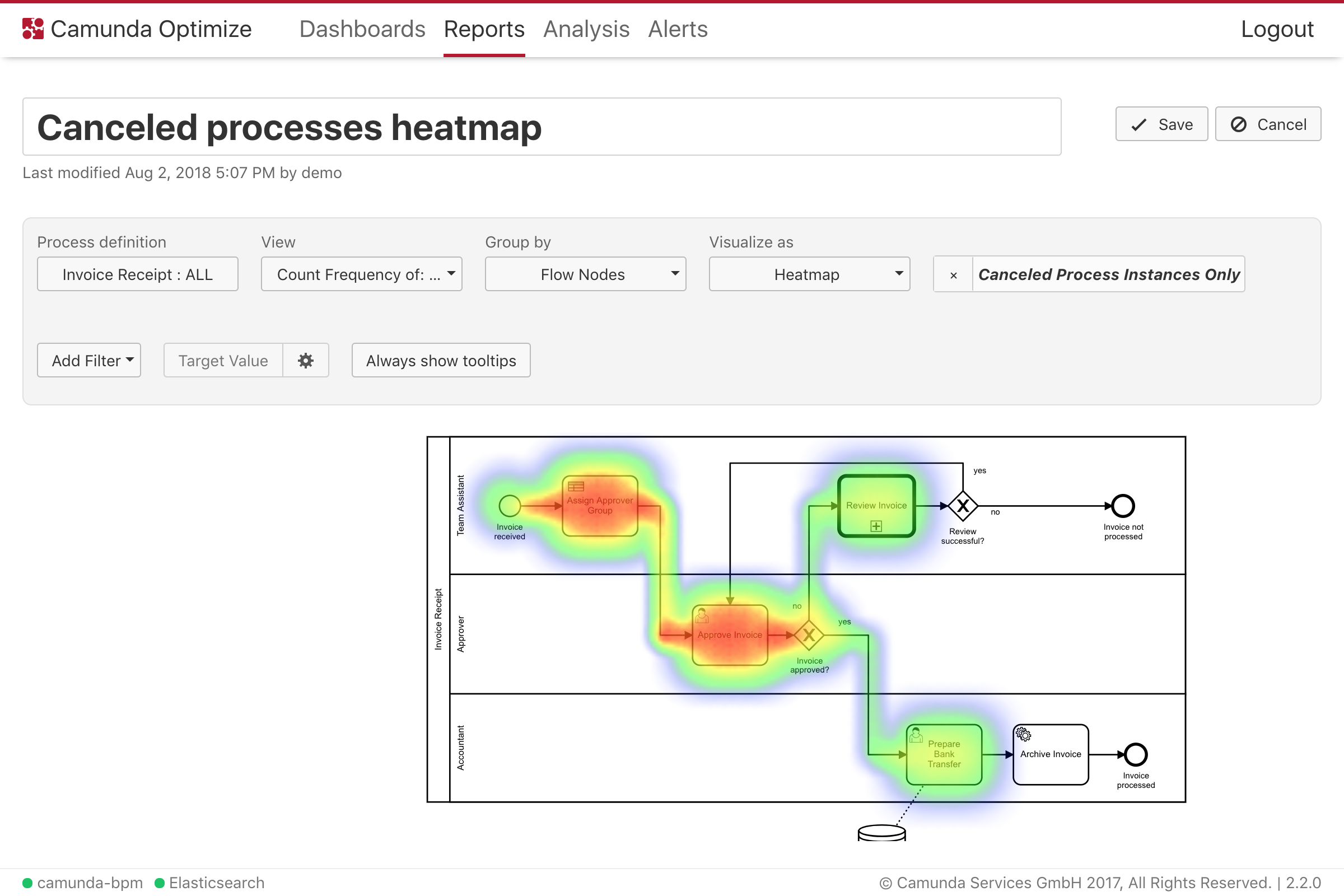
Filter by canceled process instances
In the Add Filter dropdown you can now select a Canceled Instances Only Filter. Reports with this filter applied will only evaluate data from the process instances, that were terminated (canceled) during the execution.
Filter by non-executed flow nodes
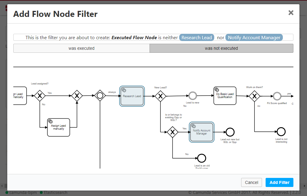
In the “Filter by Flownodes” modal dialog, there is a new button that allows you to only include process instances in your report where certain flow nodes have not been executed. You can select multiple flow nodes to create a filter where none of the selected flownodes have been executed. As always, you can see a preview of the filter you are about to create above the diagram.
Import complex variables
Filtering for variables or grouping by variables are powerful tools to analyze your data. The problem with the previous version of Optimize was, that the application only imported primitive variables. Many users have their important information hidden in complex variables, e.g. represented as JSON variables and then want to analyze fields that are hidden in those fields. With the new alpha release you can now write your own variable plugin to transform your complex variables to primitive ones to still be able to filter for your desired information. The whole import/plugin system is depicted in the following diagram:
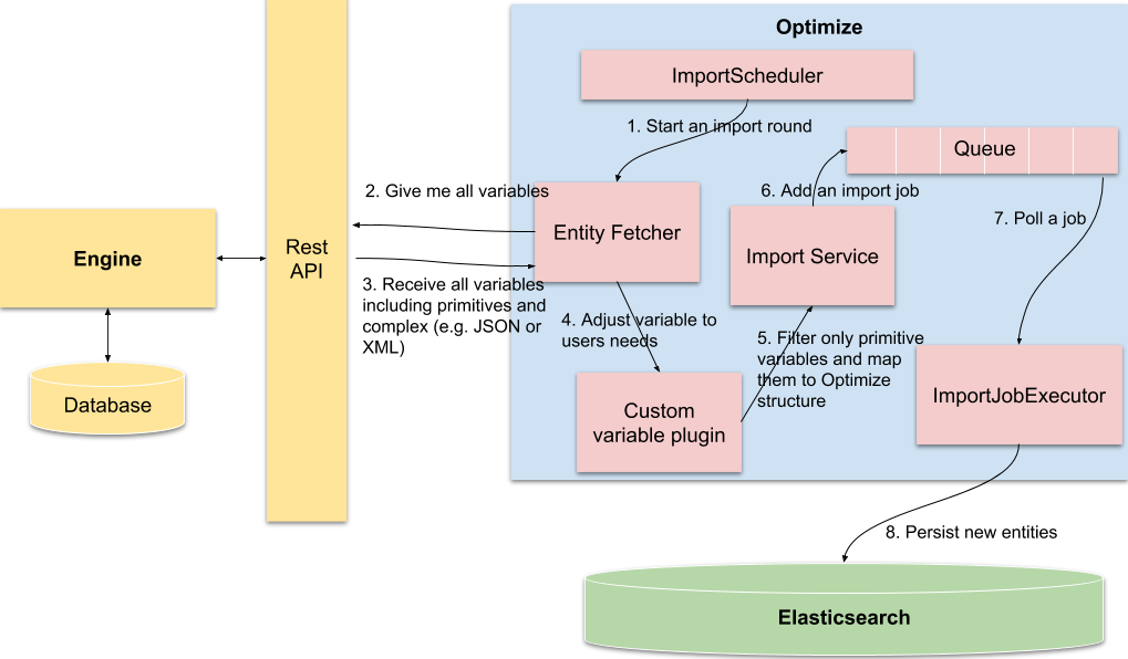
As you can see, Optimize is fetching all variables including the complex ones. Later on it is filtering out the complex variables and only stores the primitive variables into Optimize. Bad news is, that Optimize does not store the complex variables directly, but on the bright side gives you the power to write your own variable adaption plugin to map data of complex to primitives variables and then those new variables are imported to Elasticsearch.
UI/UX improvements
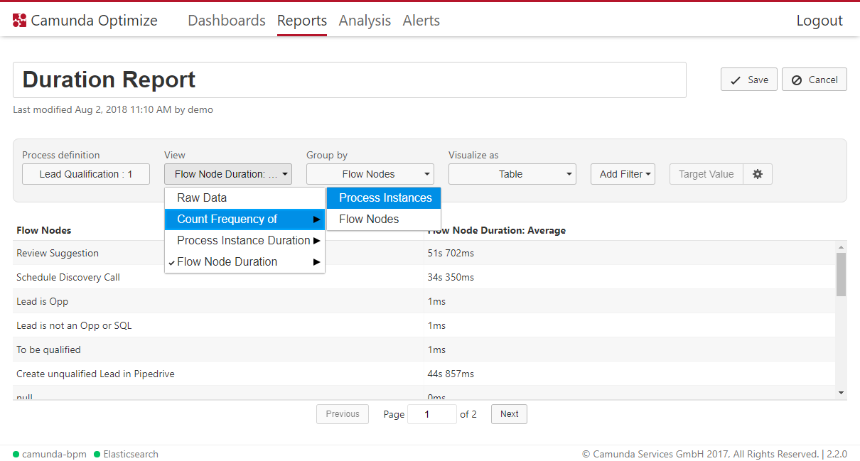
In this release, since there are many new features that got added to Camunda Optimize, It was necessary to organize all the new options in a ways to allow easy selection. To achieve that, a new menu selection for the report control panel is implemented. The new menu selection is designed to group existing features that are similar to submenus. This makes existing menus much simpler and easier to choose from.
Another important feature is the added search box in the dashboard and report list. Now it is much easier to find a report by just typing any part of the report name in the search box. Moreover, searchable selection menus were introduced to makes it easy to select from a long lists of entries. It is used in a number of places throughout the application especially in places where selecting from a list of variables is needed.
Dashboards also got some UI/UX improvements. For example, when moving a dashboard from one place to another, the dashboard snaps to a grid. It also shows feedback to the user when the placement is not possible due to an overlapping with another report.
Search through report/dashboard lists
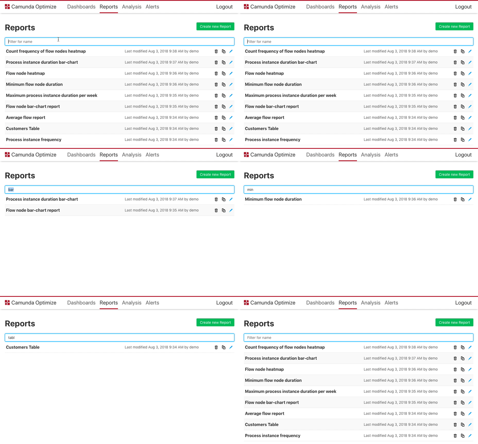
Before this release, finding a report/dashboard was only possible by scrolling through the list. This is not very efficient especially if there are a large number of entries in the list. To solve that, a new search input box is added to the dashboard/report list where users can just type the name of the report/dashboard. Doing that will automatically filter the list to show the reports that only matches what was typed into the search box. The search is case insensitive and can match any part of the report/dashboard name.
The following figure illustrates the added feature:
Search through number reports during the alert definition
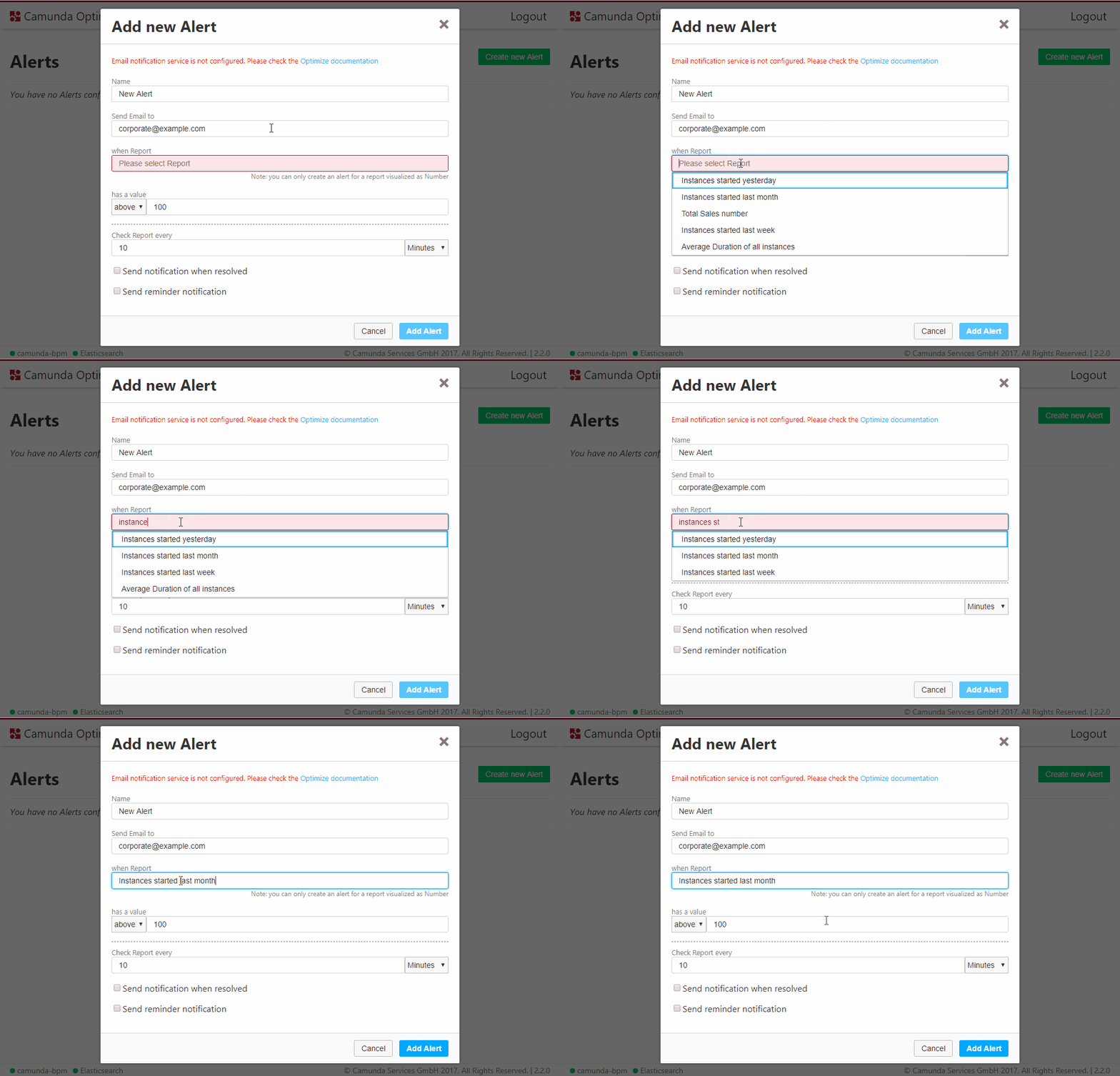
To help you quickly find the report you want to create an alert for, we replaced the old select dropdown with a new typeahead input field that allows you to search for reports by their name. Keep in mind that the list will still only display reports that are visualized as single number or duration, as alerts can only be created for such reports.
Improvements in the control panel
In the report control panel, the dropdowns for the view, group by and visualization options now have submenus, giving you a more structured layout to find exactly the option you were looking for without scrolling through a list of very detailed unrelated entries
Show relative distribution of process instances for count views
Previously, if you had a report that showed the number of either flownodes or process instances, you could see the total number of entries, but were unable to see the distribution of those entries. With this release, we add this information to all affected reports. For example, if you have a report showing the number of started process instances in every month, you could see that 45% of all process instances have been started in July.
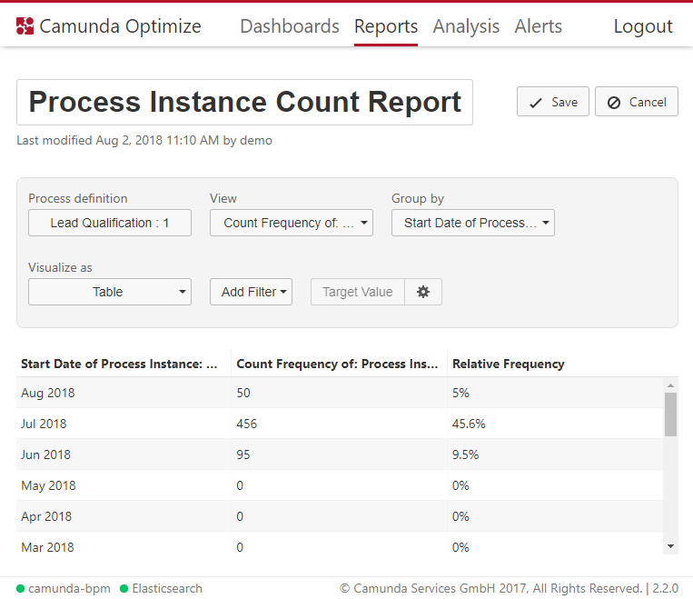
For table visualizations, this information is shown as a third column, for chart and heatmap visualizations, you can hover over an entity to see the relative value in the tooltip.
Toggle badge overlay with all actual values in Heatmap
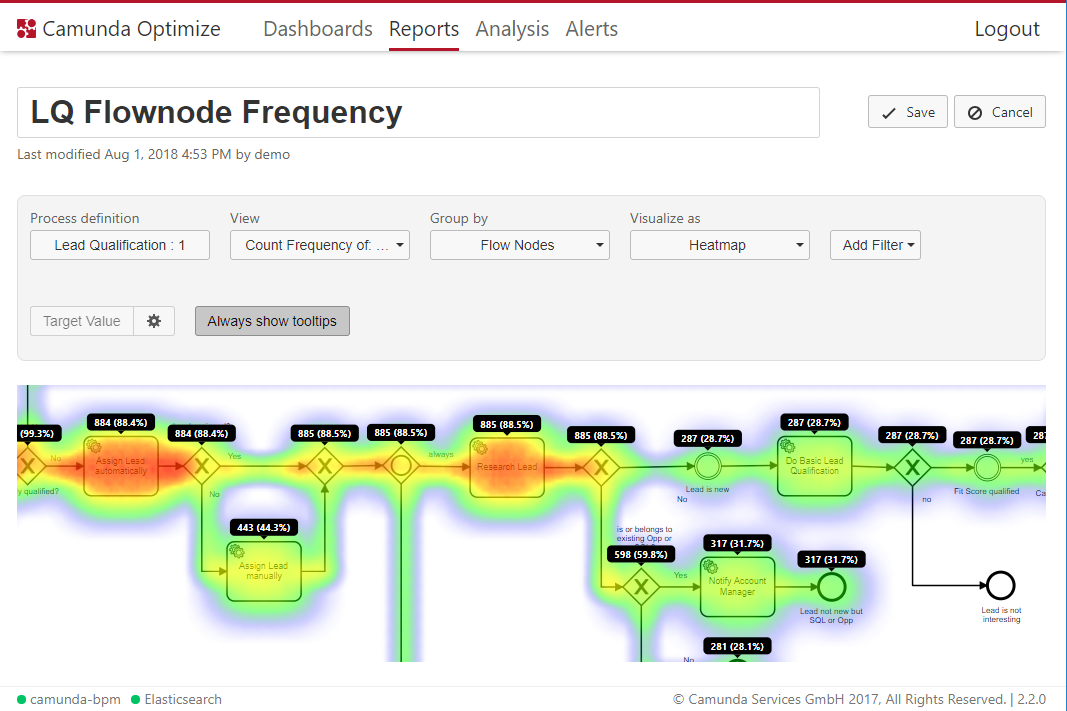
When looking at heatmaps, it’s easy to get a quick overview of the flow node distribution, but it’s hard to see actual numbers without hovering over every single flownode to inspect the tooltip. That’s why we added an “Always show tooltips” button for Heatmaps. When clicking this button, all tooltips for all flownodes stay visible. This is also possible when you have defined some target values. If you save the report in this state, the tooltips will also be shown on any dashboard this report is added to.
See where you drop your report in the dashboard
When editing a dashboard, reports are aligned to the grid in the background. This helps creating a clear and good looking layout for the dashboard. With this release we added some additional feedback when dragging a report. I gray outline shows where the report would be placed when you drop it. It also shows a red outline if the report cannot be placed at this position because it would overlap with an already existing report.
How to get it
If you want to give the new Camunda Optimize a try, you can download the release with your Enterprise customer credentials. Please sign up for a free 30-day trial version.
