Extending the BPMN properties panel to add custom elements.
UPDATE: Since the publication of this post, we have reworked our BPMN properties panel infrastructure. The examples below may no longer be accurate for the latest versions. Please visit this link for updated examples on how to extend the BPMN properties panel with custom elements.
Goal
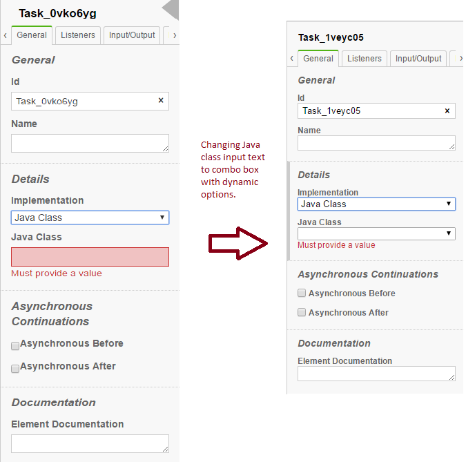
In this article, we will try to add a custom element to the BPMN properties panel under the ‘General’ tab for a service task type component. To be precise, under the ‘General’ tab, in the details sections, if ‘Java Class’ is selected as implementation type, a text box appears below. Here the user is expected to enter the java class, but our goal is to replace the text box with a combo box, where the options are populated externally with JSON/API data.

Prerequisite
If you are not aware of how to bundle the properties-panel, then please go through the properties-panel documentation.
Implementation
Get the base source code from the properties-panel repository. Once you have installed the dependencies, you will get all under node_modules. The important one is bpmn-js-properties-panel, which contains the entire implementation of the properties panel.
By navigating to lib/provider/camunda, you can see the file CamundaPlatformPropertiesProvider.js, where all tabs displayed under the properties panel are aggregated. By following its require files, it can be easily understood that the text-box displayed under the ‘General’ tab details section is a result of the file under /lib/provider/camunda/parts/implementation as Delegate.js, when the implementation type is ‘class’.
Once we get the file, it is not straight forward to edit it into a select box, as it is used as a generic file for various implementations. Let’s consider our goal: we only want the select box when the implementation type is ‘Java Class’. Else, this textbox should be shown as is. From here we have two ways to add our select box.
- We can add one more var as
var delegateEntrySelectwith all the code in the same file, and return in array. - Create a separate file adjacent to
Delegate.jsand use it in ServiceTaskDelegateProps.js, to where all service task components are pushed.
For modularity purposes, we shall stick to option 2, a new file. Let’s say our file name is DelegateSelect.js, under the same location /lib/provider/camunda/parts/implementation. See the code below:
'use strict';

var entryFactory = require('../../../../factory/EntryFactory'),
    cmdHelper    = require('../../../../helper/CmdHelper'),
    domQuery = require('min-dom/lib/query'),
    $ = require("jquery")
var DELEGATE_TYPES = [
  'class',
  'expression',
  'delegateExpression'
];

var PROPERTIES = {
  class: 'camunda:class',
  expression: 'camunda:expression',
  delegateExpression: 'camunda:delegateExpression'
};

function isDelegate(type) {
  return DELEGATE_TYPES.indexOf(type) !== -1;
}

function getAttribute(type) {
  return PROPERTIES[type];
}

function getDelegationLabel(type) {
  switch (type) {
  case 'class':
    return 'Java Class';
  case 'expression':
    return 'Expression';
  case 'delegateExpression':
    return 'Delegate Expression';
  default:
    return '';
  }
}

module.exports = function(element, bpmnFactory, options) {

var getImplementationType = options.getImplementationType,
  getBusinessObject     = options.getBusinessObject;

var delegateEntrySelect = entryFactory.selectBox({
    id: 'delegateSelect',
     label: 'Value',
    selectOptions: [
      {value:"one",name:"one"},{value:"two",name:"two"}
    ],
    modelProperty: 'delegate',
    emptyParameter: false,

    get: function(element, node) {
      var bo = getBusinessObject(element);
      var type = getImplementationType(element);
      var attr = getAttribute(type);
      var label = getDelegationLabel(type);
      return {
        delegate: bo.get(attr),
        delegationLabel: label
      };
    },

    set: function(element, values, node) {
      var bo = getBusinessObject(element);
      var type = getImplementationType(element);
      var attr = getAttribute(type);
      var prop = {};
      prop[attr] = values.delegate || '';
      return cmdHelper.updateBusinessObject(element, bo, prop);
    },

    validate: function(element, values, node) {
      return isDelegate(getImplementationType(element)) && !values.delegate ? { delegate: 'Must provide a value' } : {};
    },

    disabled: function(element, node) {
      //TODO Disabled condition
    }
});

 return [ delegateEntrySelect];
};
Basically, it’s the code borrowed from the Delegate.js file. A few keys points to note here are:
- We have replaced textField by entryFactory.selectBox with its get and set methods.
- Model Property name is same here, i.e., delegate.
- Under disabled condition there is nothing, because we will get to that a little bit later, where it makes more sense.
Plug into Tab Elements
Once we have the file ready, we need it to now cue into the tab details section. Navigate to the file ServiceTaskDelegateProps.js #Line60, where you can see the entry group.entries.concat(delegate(element, bpmnFactory,... The original Delegate.js file is imported at the top and used here. Similarly, we need to import our newly created file DelegateSelect.js and implement it in similar manner.
Initially, for all the options [Class, Delegate, Expression], a textbox was displayed. But now, only when the implementation type is ‘Class’, we want our select box to be displayed. Otherwise, the regular textbox should always be displayed. Now the disabled condition left in the TODO section of the above file makes sense. First, let’s see how to cue the selectbox inside the group entry.
Inside ServiceTaskDelegateProps.js let’s first import the file and then push the Delegate Select item.
var delegateSelect = require('./implementation/DelegateSelect');Now its time to push the component into group array. It makes sense to push before the Delegate code #Line60, thus we get the select box in the desired location like this
group.entries = group.entries.concat(delegateSelect(element, bpmnFactory, {
    getBusinessObject: getBusinessObject,
    getImplementationType: getImplementationType,
    hideDelegateSelect: function(element, node) {
      return getImplementationType(element) !== 'class';
    }
}));
Here, I have passed one more option as hideDelegateSelect which will hide this component based on the condition if the implementation type is not ‘Class’. Now it’s time to add it into the DelegateSelect.js file. There are two things to take care of. First we need to get the option and then write the implementation for disabled function.
var getBusinessObject = options.getBusinessObject;and the implementation of function as
disabled: function(element, node) {
    if (typeof hideDelegateSelect === 'function') {
        return hideDelegateSelect.apply(delegateEntrySelect, arguments);
    }
}
Similarly, we also need to change the condition for textField to not be displayed on value ‘Class’, else we will have both select box and text. To do so, change ServiceTaskDelegateProps.js as:
group.entries = group.entries.concat(delegate(element, bpmnFactory, {
    getBusinessObject: getBusinessObject,
    getImplementationType: getImplementationType,
    hideDelegateText: function(element, node) {
      return getImplementationType(element) === 'class';
    }
}));
To handle hideDelegateText inside Delegate.js
var hideDelegateText = options.hideDelegateText;and the implementation of function as
disabled: function(element, node) {
    if (typeof hideDelegateText === 'function') {
        return hideDelegateText.apply(delegateEntry, arguments);
    }
}
At this point in time, if your grunt auto-build ran successfully, you will now see that, when you select ‘Class’ as implementation type under service task, a select box is displayed. For other implementation types, it is a text box. Everything seems quite well, but inside the select box we have values (one, two) which don’t make much sense. So let’s populate the values dynamically from an API call.
Dynamically passing value to Select Box
Let us try two ways of passing values dynamically:
- Passing value from a local JSON file
- Getting values from an external network via an ajax call
Rendering Values from a local JSON file :
Consider you have an local JSON file in path, say delegateSelect.json is adjacent to delegateSelect.js as :
[
  {
    "name" : "com.classes.ClassOne",
    "value" : "com.classes.ClassOne"
  },
  {
    "name" : "com.classes.ClassTwo",
    "value" : "com.classes.ClassTwo"
  },
  {
    "name" : "com.classes.ClassThree",
    "value" : "com.classes.ClassThree"
  },
  {
    "name" : "com.classes.ClassFour",
    "value" : "com.classes.ClassFour"
  },
  {
    "name" : "com.classes.ClassFive",
    "value" : "com.classes.ClassFive"
  }
]
We just need to import this JSON and bind to selectOptions in delegateSelect.js as follows :
  var selectValues = require('./delegateSelect.json');

  .
  selectOptions : selectValues,
  .
  .
Resolving values from an external resource via an ajax call
To accomplish this, We will leverage the setControlValue attribute from selectFactory To do so we need to do some changes inside DelegateSelect.js file as follows:
- Need to change value of selectOptions from list to function as we see the function being called.
- We need to add one more property as setControlValue to
trueto register it as dynamic rendering value component.
selectOptions: function(element, node) {
    var arrValues = []
    $.ajax({
        url: ${your-url},
        method :"GET",
        success: function (result) {
          arrValues = result;
        },
        async: false
    });
    return arrValues;
},
setControlValue :true
Note : The result of the ajax call is something similar to the JSON above
I have used $ because of the import statement added above as :
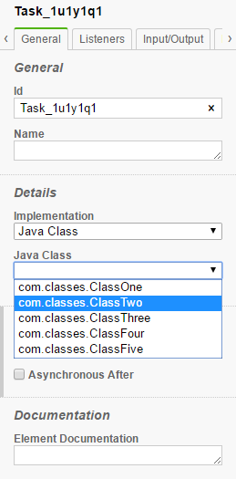
var $ = require("jquery");So now, whenever selectOptions is called, a server call is resolved and the value is passed back to select factory to populate the inside component. So if everything works well, you will get your custom select box auto-populated with the values returned from the server as :

Summary
In this post, I showed how to add a custom element to the BPMN properties panel as a select box and pass dynamic options to it. While doing this task, I faced quite a few problems which I posted on the forum. But then I got the answers by understanding the Camunda code itself, to hide the elements I just followed resultVariable.js and to pass dynamic options I followed inputOutputParameter.js to reach the solution.

Camunda Developer Community
Join Camunda’s global community of developers sharing code, advice, and meaningful experiences
