Have you ever thought about using forms in your Camunda processes to boost productivity and further enhance your applications? Well, there may be a few things about forms that you don’t know that can significantly improve your application, and we want to share some of those productivity-boosting features with you here.
If you haven’t had the chance to read and try some of the exercises in our blog about forms a few months ago, Camunda Forms Features you Probably Don’t Know About, we encourage you to check that out as well.
In this post, we’re going to dissect a few features and functions available with Camunda Forms that can address your everyday needs and help you process things faster and more efficiently.
For the first example, let’s see how to modify the form. We will then take a deeper dive into the form in the remaining examples. Let’s get started.
Note: If you want to run through some exercises with these forms on your own, please access the GitHub project for the sample forms. You must perform these exercises on Camunda 8.5 or higher. This blog assumes you have general knowledge of Camunda Modeler, Forms, and Tasklist.
Applying for a debit or credit card
A common user-facing task in financial services is filling out the application to request a credit card. If you use Camunda for this onboarding process orchestration, a prospective customer may use a Camunda form to initiate the application process. By designing this form to be simple, easy to use, and aesthetically pleasing for the applicant, you can boost productivity, allowing you to process more credit card applications each year.
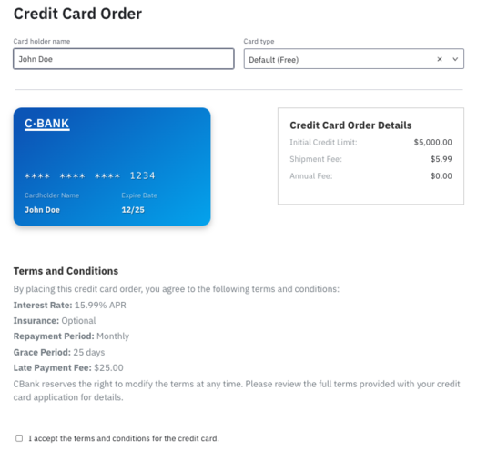
The simple and sleek but well-designed form shown below allows you to provide various user options such as the credit card type, limit, and the associated fine print for the agreement.
Let’s dissect this form and see what’s behind the scenes.
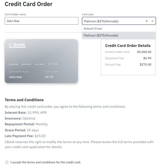
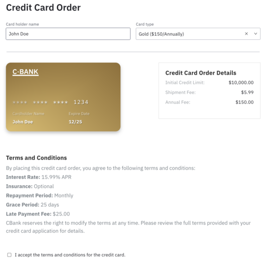
First, let’s take a look at the visual layout of the form. As you can see, the customer can simply enter their desired cardholder name and select the card type from the dropdown list of options. Based on the type of card selected, the credit card image changes to match the chosen card. The order details along with the terms and conditions are appropriately updated as well.
As you can see, the card changes to reflect the type, and the details also change (Annual Fee).
These dynamic changes make the form more intuitive for the applicant and easier to use. They allow the user to see pertinent information quickly and then just as quickly make an accurate selection meeting their needs.
How is this accomplished?
Now let’s look at how this form was created so we can see how Camunda Forms provides these capabilities.
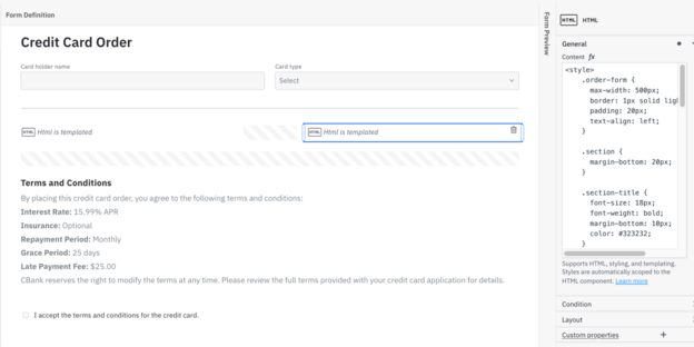
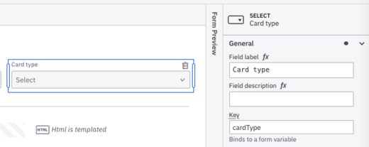
The form starts with a simple text field (Card holder name) and a select element field (Card type). The latter provides the selection of the card type—Default or Platinum. One of this form’s most standout features is the changing card image based on the selection. The Credit Card Order Details section is also dynamically updated.
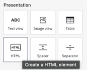
How can you do this? In this case, the form takes advantage of an HTML view element.
With the formatting and logic provided by HTML, you can enhance the aesthetics of the form. Take a look first at the HTML view element on the right of the form as indicated below outlined in blue.
You’ll notice the HTML by reviewing the field properties area. You can expand this section by hovering over the HTML in the details and selecting the pop-out icon in the upper right-hand corner of the Content area. If you review this HTML, you will see that some of the text is hard-coded (shipping and credit limits), but the annual fee is dynamic based on the selected card type.
Updating the form
To best understand how to provide this functionality, you need to modify the form to provide a third card option for Gold with a different annual fee, different credit limit, and credit card image. In addition, you’ll modify the HTML associated with the credit card image to appear as gold when a Gold card is selected.
Update the card selection
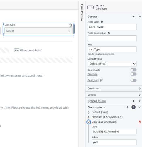
First, you need to provide the option for another card to the prospective applicant. Select the Card type field and then add another static option.
- Gold ($150/Annually)
goldfor the value
Update the card order details
Now you want to reflect these changes into the card order details section of the form. Select the HTML view element on the right and open the content section to review the details. Find the order-form division class, which should look like this:
<div class="order-form">
  <div class="section">
    <div class="section-title">Credit Card Order Details</div>
    <div class="detail">
      <span class="detail-label">Initial Credit Limit:</span>
      <span>$5,000.00</span>
    </div>
    <div class="detail">
      <span class="detail-label">Shipment Fee:</span>
      <span>$5.99</span>
    </div>
    <div class="detail">
      <span class="detail-label">Annual Fee:</span>
      <span>${{if (cardType = "platinum") then "275.00" else "0.00"}}</span>
    </div>
  </div>
</div>
As you can see, the cardType variable (key) is used in the syntax to select different values when the type of card changes.
To modify this, replace the text for the Initial Credit Limit (as shown below)…
<span class="detail-label">Initial Credit Limit:</span>
      <span>$5,000.00</span>
with an if statement that will allow it to change based on the card selected. The new line will look like this:
<span class="detail-label">Initial Credit Limit:</span>
      <span>${{if (cardType = "platinum") then "15,000.00" else if (cardType = "gold") then "10,000.00" else "5,000.00"}}</span>
Then, replace the text for the Annual Fee (as shown below)…
<span>${{if (cardType = "platinum") then "275.00" else "0.00"}}</span>with an expanded if statement to include the annual fee for the Gold card:
<span>${{if (cardType = "platinum") then "275.00" else if (cardType = "gold") then "150.00" else "0.00"}}</span>Your new order-form division should look like this now:
<div class="order-form">
  <div class="section">
    <div class="section-title">Credit Card Order Details</div>
    <div class="detail">
      <span class="detail-label">Initial Credit Limit:</span>
      <span>${{if (cardType = "platinum") then "15,000.00" else if (cardType = "gold") then "10,000.00" else "5,000.00"}}</span>
    </div>
    <div class="detail">
      <span class="detail-label">Shipment Fee:</span>
      <span>$5.99</span>
    </div>
    <div class="detail">
      <span class="detail-label">Annual Fee:</span>
      <span>${{if (cardType = "platinum") then "275.00" else if (cardType = "gold") then "150.00" else "0.00"}}</span>
    </div>
  </div>
</div>
Update the card image
Finally, you’ll want to provide an option for the card image to appear gold. Locate the remaining HTML view element on the left side of the form and expose the content section. In this section of the HTML, you will notice that the cardType variable (key) is used again in the syntax to select different image colors when the type of card changes.
Find this section of code in the HTML:
<head>
  <meta charset="UTF-8">
  <meta name="viewport" content="width=device-width, initial-scale=1.0">
  <title>Debit Card</title>
  <style>
    .card {
      width: 350px;
      height: 210px;
      padding: 20px;
      color: #fff;
      border-radius: 15px;
      position: relative;
      box-shadow: 0px 5px 10px rgba(0,0,0,0.24);
      background: linear-gradient(321.03deg, #01adef 0%, #0860bf 91.45%);
    }
Add the code below under the close bracket:
    .card.type-gold {
      background: linear-gradient(45deg, #dfbd69, #926f34);
    }

    .card.type-gold:before {
      content: '';
      position: absolute;
      top: 0;
      left: 0;
      right: 0;
      bottom: 0;
      background: linear-gradient(to bottom right, #926f34 0%, transparent 50%, transparent 100%);
      z-index: 1;
      border-radius: 15px;
    }
These lines will add the colors required to show a Gold card when that card type is selected.
Preview your new form
You can preview these changes to see the effects. For example, if the prospective cardholder selects a Gold card option, it should look like the image below.
These simple but highly effective small changes provide an interface for your prospective clients that is informative, easy to use, and aesthetically pleasing. This helps with customer engagement and simplifies the form input process, promoting customer satisfaction and the growth of your customer base.
Making an automobile insurance claim
For an automobile policyholder, one of the most tedious tasks is claiming an accident with your vehicle and processing that claim within the insurance company. Many details must be captured or read from other systems and then displayed to the claimant as part of the process.
By allowing processors to view all required data in a single view, you can increase productivity and optimize the claims process—especially for your customers.
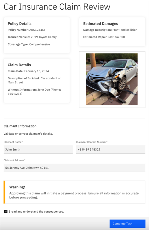
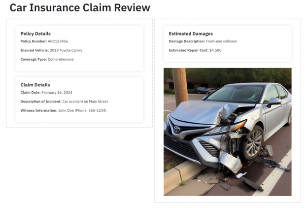
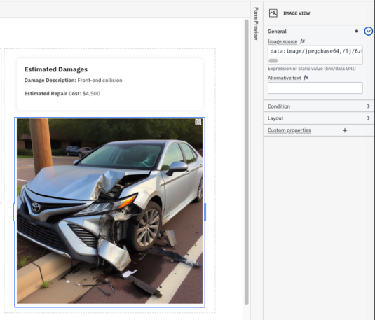
In the form reflected below, the policy is presented as well as the policy’s coverage, the estimates for damages as prepared by the adjuster, and claim details. At this step in the process, the form reflects the ability to accept the damages and pay the claim by approving the task.
In this form, grouping provides a well-formatted, clean layout of the form. Combining grouping with HTML and image elements, all the information is available at the reviewer’s fingertips, eliminating the need to review other systems or even scroll to see additional data.
You can see that the damages appear directly above the photo of the vehicle—for easy review and assessment—in a single group. The policy and claim details are in another group on the left.
In this example form, the policy number, and other data are hard-coded in the HTML view element. However, as shown in the previous example, these could be populated using variables from the process. For example, in the same form, you can find this HTML for the HTML view element with the policy details:
    <div class="info-item">
      <span class="info-label">Policy Number:</span>
      <span class="info-value">ABC123456</span>
    </div>
If you modify this code block to look like what you see below, you can have a policyNumber variable previously captured in the process and then displayed in the form.
    <div class="info-item">
      <span class="info-label">Policy Number:</span>
      <span class="info-value">{{if (policyNumber != "") then policyNumber else "-"}}</span>
    </div>
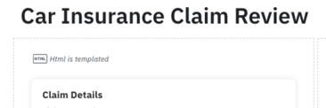
Also notice that as soon as you modify the HTML view element to include variables, the form shows the block as Html is templated instead of reflecting the display of the HTML in the form.
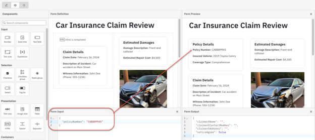
You can see the results in the form preview by providing the proper Form Input with the value of the policyNumber.
Under the estimated damages section—which can also use process variables as previously demonstrated—the image element is utilized. This image uses a base64-encoded image of the vehicle in the accident.
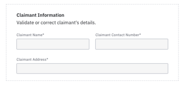
At the bottom of the form is an area to confirm the policyholder’s name and address for payment. These are text fields that must be filled in (denoted by the asterisk) in order to process payment for the claim.
There is also a warning and a required action in the form of a checkbox to ensure that the reviewer understands the action of approving the form.
One of the keys to productivity is ease of use and access to the right information. By selecting the most important data about the automobile claim and providing it in a single place—on the claim form—reviewers can make the right decision quickly and efficiently.
Logging work in an external application
In some cases, your process orchestration may require the ability to work in an external system and provide the results as part of the process. In most cases, this external system integration would be automated using APIs or connectors, but if these are unavailable, you can use this approach as an alternative.
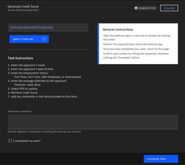
This form reflects a link to launch another system providing the end user with instructions related to the actions to take in that system and to log that the work has been completed on the form.
Using this simple form, the end user is directed to open the external application using the button provided. Once accomplished, the user uses the proper field to add notes, checking the required box when the work is completed.
The form’s design means it can be used for multiple applications with different instructions. The URL is a variable (externalAppUrl) as are the task instructions (taskInstructions). This approach allows the form to be used with any application, providing the appropriate instructions each time.
Let’s take a deeper look at what features we can see used in this form.
How is this done?
Once again, this form leverages HTML view elements to enhance the form and provide additional functionality. Using the HTML view element, the end user can simply click the blue button on the form to open the external application to complete. In this case, that means updating the customer address in that system. You just have to define the externalAppUrl variable to pass the link to the external application.
As mentioned, you can also pass taskInstructions to provide details on what needs to be accomplished in the external application.
Trying it out
A simple BPMN file entitled Access External Application is provided that just needs to be linked to the form Work in an External Application. If you deploy and run this application, you can see how this works.
Note: It is recommended that you use an application URL that you have access to, but you can deploy our sample index.html file to use it for this exercise.
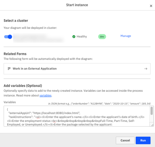
When you run the process, you need to provide input to that process. An example is shown below; however, you must replace the externalAppUrl with the URL for your index.html file provided (or the application of your choice).
{
"externalAppUrl": "https://localhost:8080/index.html",
"taskInstructions": "<ol><li>Enter the applicant's name.</li><li>Enter the applicant's date of birth.</li><li>Enter the employment status:<br>     Full-Time, Part-Time, Self-Employed, or Unemployed.</li><li>Enter the package selected by the applicant:<br>     Platinum, Gold, Blue.</li><li>Select PF5 to update.</li><li>Retrieve Credit Score.</li><li>Add any comments in the field provided on this form.</li></ol>"
}Run the process
Click Run to run the process, adding the JSON variables in the location provided before starting the process instance.
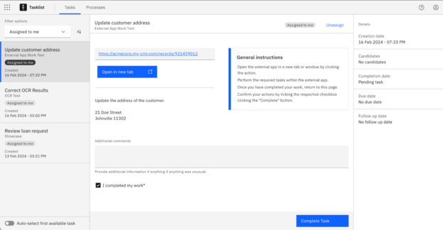
Once started, click the Tasklist tab to assign the process to yourself and display the form.
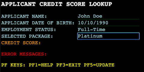
You will see that the instructions are formatted properly in the area provided in the form. Your URL for the external application is also present. You can click Open in new tab to launch your external application. In our case, this looks something like this:
Once you take the appropriate steps, you can close this window and update the form with any comments, checking the box that you’ve completed the work in the external application.
A form like this is beneficial because of the flexible way it’s written, allowing the end user to complete all work without leaving the existing form. This boosts their productivity and allows the completion of work with ease and speed.
Creating invoices
Our final example provides a method to generate invoices using a Camunda Form. Many companies can automatically generate invoices, and others may use more manual methods or programs for this requirement. However, in either case, there may be situations where ad hoc invoice generation is needed or desired. The creation of an invoice using a Camunda Form that can then access and work directly with the inventory and cost systems is an excellent solution for invoice generation and order processing.
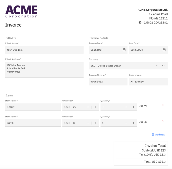
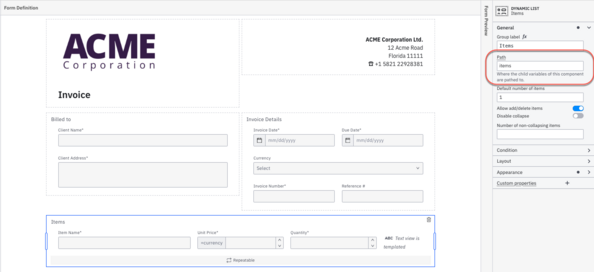
Something like the form below offers a sophisticated and simplified interface for generating an invoice for a customer. It can then easily be used to generate and process the order.
In this case, the form user can add and remove rows from the list of items for ordering, and the totals will automatically calculate subtotal, tax (at 10%), and total. We’ll skip over the description of the other elements which are a combination of groups, HTML view elements, text inputs, date, and select fields.
Review the form
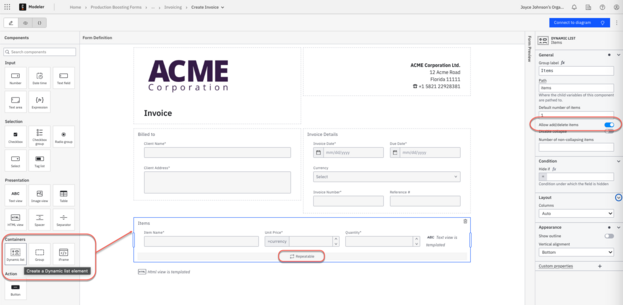
The key to this form is the use of the dynamic list element and how the calculations are done on the form.
Dynamic list element
The dynamic list element can be used with multiple elements in the list. Users also have the ability to add or delete rows from the list.
In this case, each list element consists of the following:
- Item Name – Input text field
- Unit Price – Input Number field
- Quantity – Input Number field
- HTML view element
The user can click Add new to add a list element (row) or click X to remove an item, both in the preview and within a process.
Calculations
As seen in the form, the items for the invoice use the dynamic list element with an HTML view element as the final column in each row. These are grouped with an element key of items. This is important when referencing the fields within each row in the dynamic list.
When you select the HTML view element at the end of the dynamic list element, you’ll see that the HTML performs a calculation to obtain the unit cost times the quantity:
{{currency}} {{this.unitPrice * this.quantity}}Note that this refers to the individual row of the list.
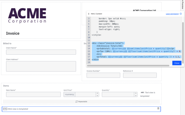
The final calculations for the form are also done within the HTML view element at the bottom of the form.
In this HTML, the items key is referenced using the JavaScript methods of sum and floor to generate the subtotal, tax at 10%, and the final total.
<div class="invoice-total">
    <h4>Invoice Total</h4>
    <p>Subtotal: {{currency}} {{sum(items[unitPrice * quantity])}}</p>
    <p>Tax (10%): {{currency}} {{floor(sum(items[unitPrice * quantity]) * 0.1, 2)}}</p>
    <hr>
    <p>Total: {{currency}} {{floor(sum(items[unitPrice * quantity ]) * 1.1, 2)}}</p>
</div>
By providing these immediate calculations for the user, the form provides details for the user, allowing for changes to the quantities or items on their order in a dynamic way. This boosts the productivity provided by the form and improves your customer experience.
Creating forms to boost productivity
As you can see, there are a variety of elements and methods that can be used to enrich your forms and make them easier to use.
Further your knowledge
There is so much more you can do with Camunda Forms. For additional reading, we suggest:
- Build Forms Faster with Camunda Form Builder and Generative AI
- From Draft to Perfection: Creating Effective Forms for Human Workflows
- Build, preview, and test dynamic forms for user tasks
- Camunda Forms Features You Probably Don’t Know About
Sign up for a Camunda plan today and get started with a 30-day free trial!
If you already have a trial and want to continue with the capabilities of the Starter plan, you can ensure a smooth transition by upgrading today.
